Sunday, February 27, 2011

Give Me Liberty.....of London!

Here is what I love: Jane Austen, tea parties, Jane Austen themed tea parties, Anthropologie window displays, traveling, Cavelier King Charles Spaniels, and.......Liberty of London. Pardon the title's anti-patriotic play on words -- Patrick Henry is rolling in his grave right now.  My first encounter with Liberty came during my first real trip abroad to England when I was a wee precocious ten year old, and it is to this family vacation that I blame my obsessive adoration for all things British. During our tour of London ("tour" being used in a loose sense, if you consider my dad shuffling us around with his Rick Steve's guide, fanny pack, and zip-off pants a proper "tour"), in between the Tower of London and afternoon tea at Brown's, my mother and I hit up all the classic department stores, including Harrod's and Liberty. It was at Liberty that I truly fell in love: from it's spectacular Tudor facade to the miles and miles of beautiful prints inside. 


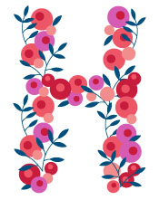
To me, Liberty embodies British chic. Established by Arthur Liberty during the Victorian Era in 1875, the iconic British department store introduced Eastern textiles and other goods to the West and soon became synonymous with bold floral prints and decorative patterns. In this video, Liberty's creative director, Tamara Salman, talks about the history of Liberty, as well as the company's design process.


Fortunately, thanks to the lovely people at the Gap, MAC Cosmetics,  Nike, and most recently Target, you don't have to travel to London to see Liberty's beautiful prints; over the years, Liberty has created adorable (and economical) product and fashion lines for a variety of stores. Give me Liberty!


 For this Drop Cap, I recreated one of Liberty's classic floral prints into the shape of an H.

My Apologies to Her Majesty

In my excitement for the Arts and Crafts and Art Nouveau movements, it has come to my attention that I completely bypassed design of the Victorian Era. My apologies to Her Majesty, considering this period of the 19th into 20th centuries was kind of a big deal. (Slightly off topic but not completely, a movie came out about a year ago called The Young Victoria, starring the lovely Emily Blunt and the even lovely-er Rupert Friend, which tells the story of the real life romance between Queen Victoria and her husband Prince Albert. It is kind of amazing, if you are into that "petticoats and knickers-wearing tea drinkers" kind of genre.)

This is not the pseudo-Victorian (pronounced "Vic-tau-vian" by middle-aged Long Islanders) unofficial design movement in suburban architectural design of the mid-1990s, where ranch style homes built in 1945 somehow received gingerbread embellishments and wrap-around porches, and whose interiors smelt of potpourri and doilies. Maybe I am the only person bothered by this, but I digress. Meanwhile, back in 19th century Britannia....

The Industrial Revolution brought with it innovations in production, printing, and photography. Among these are the commercialization of chromolithography, or color printing, which became more efficient and economical during this period. If you are a graphic design student like me, you will understand the importance of color printing when you are waiting on line at the 24 hour Kinkos trying to print your tetra pak juice box packaging at 3 in the AM, after the Xerox wide format inkjet at school ran out of magenta. So thank you Victorians!

What I am taking a very long time to get to is the packaging design of this period. With the multitude of new manufactured goods, packaging was needed to contain and sell them. The Victorians made use of new technologies like chromolithography to print on tin for food and tobacco products. Advances in printing technology allowed for the intricate details on type and embellishments popular during this period. I found a beautiful example of this tin packaging on The Dieline.


I have noticed a lot of current packaging that references this Victorian aesthetic. I went to the Tea & Coffee Festival in New York this past weekend (as a true tea weirdo) where I stocked up on some absolutely delicious Harney & Sons loose teas. They are packaged in these beautiful printed tins, much like their Victorian counterparts, and feature the same attention to detail in terms of type and decoration.


I am embarking on a new project. I am going to try and create my own drop cap for each (or at least some posts) and try and relate the design of each to the post's content. For this one, I tried to incorporate some of the ornate, floral-like details present on the Victorian packaging.

Sunday, February 20, 2011

About Busy Nothings

What started out as a required weekly assignment for my History of Visual Communications class has evolved over the past few months into a full-fledged blog? Yes? Am I officially a "blogger"? Oh dear....

What I find most interesting about current graphic design work are the inherent references and historical connections to art movements of the past. I welcome these little nuggets of genius, and so goes the saying, "Bad artists imitate, Great artists steal"; totally OK in my book. As a creative person, I find inspiration constantly, so this blog has become a venue for me to share little things I like or find visually interesting. I have always be drawn to things that are antiquated, whether it be a classic novel, a period film, or my grandmother's costume jewelry from the 1950s. I am often found rummaging through odds and ends at thrift stores, flea markets, and garage sales (or my mother's closet) looking for little treasures. These collected items inspire and inform my work as an artist and designer.  My design point of view yes, is a little biased, but what can I say, I like things that are pretty!

*A note on the Title: I admit it. I am a self-proclaimed Jane Austen fanatic. The title was taken from one of Austen's many brilliant quotations, “Life seems but a quick succession of busy nothings.”

Thanks for visiting!

Tuesday, February 15, 2011

Brrrrr....it's cold in here

AAnyone? Anyone? Bring It On? Someone tell me how that movie came out 11 years ago?!?!?! Ridiculous. Anyway, back in 2011 and WHEN will this horrible cold weather go away? I am soooo longing to lie down on the beach with my SPF 45, some lemonade, and a good book. And who better to visualize my warm weather wishes than my wanna-be best friend Jessica Hische. I am beginning to sound like a broken record with this one, but I swear she is amazing!


This illustration was created for the Wall Street Journal's Summer Book Review. Hische's piece cleverly marries text and image, employing the tiles of a pool as pixel-like units to build the type. And I couldn't help but think, "uh Jessica? This looks familiar....."
 

In the fantastic book, The Poster in History, by Max Gallo, this beautiful poster by Edward Penfield caught my eye. This advertisement for the New York Times, from 1895, illustrates the poster with, get this, a beautiful TILE pattern for the figure, background, AND type treatment. I guess great minds do think alike. This piece is a wonderful example of early Art Nouveau poster design with female subject, the elegant scroll motif, and unusual choice of textural reference. The illustration even tricks the eye (trompe l'oeil) where the newspaper corner extends beyond the frame of the portrait.


**Drop Cap "A" courtesy of Jessica Hische, Daily Drop Cap.

Voulez-vous arte nouveau avec moi?


Oooh la la how I LOVE Art Nouveau! This period from the late 19th to early 20th centuries widened the scope of design and its application, and elevated the poster into a real art form. I especially adore the poster art of Alphonse Mucha. I have a reproduction print of his Monte-Carlo, Monaco poster that my mother bought in Paris in the 1980s framed in my room:

.....That's better

Mucha is famous for the collection of posters he created during this period; his aesthetic embodies le style moderne, incorporating influences from Japanese, Byzantine, and Rococco French patterns and textures into a very ordered symmetrical floral pattern that somehow feels organic and almost effortless. 

From my wall: Sorry, this is a pretty terrible picture....

**Drop Cap "O" courtesy of Jessica Hische, Daily Drop Cap.

Monday, February 14, 2011

Designer Profile: Lap Partners

If only everyone could be so lucky.....

Lab Partners is the design and illustration studio of Sarah Labieniec and Ryan Meis. Inspired by nature, travel, and their animal companions, the husband and wife team work together as a means to share and explore what they love.

.....how adorable!

Gotta love the Dexter poster.....hee heee


Tuesday, February 8, 2011

Yay for Arts and Crafts!

NNope, no glue guns, popsicle sticks, or pom poms here -- I am talking about the Arts and Crafts Movement of the late 19th century! This period marks a return to the handmade aesthetic as a response to growing industrialism throughout Europe and the United States, encompassing not only art and design, but home furnishings and architecture as well. Artisans of this time employed old world techniques of printing and design, also adopting a gothic-medieval style. It is to Arts and Crafters like William Morris and his buddies that we are all eternally indebted for designing some of the most outrageously beautiful books, typefaces, textiles, and wallpapers. EVER.

For my last birthday, my mom gave me a wonderful book, The Pattern Sourcebook: A century of surface design, by Drusilla Cole. In it is a catalog of prints and patterns collected from textiles, wallpapers, furniture, ceramics, and other decorative designs that spans from the early 1800s to contemporary. For me, it is my go-to book for inspiration....perhaps a little like Owen Jones' 1856 catalog The Grammar of Ornament, yes? Anyway, as I was perusing through the book, I came across some lovely Arts and Crafts samples from Willy Morris and friends. You can clearly see the Medieval influences in these ornate prints with interlocking elements, which are also echoed in their type and book designs. My favorite is the second picture, Carnation by Kate Faulkner, which was the first machine-printed wallpaper design that the William Morris & Co. ever printed. True, to their mission of traditional hand crafts, the Morris Co. only printed one other design by machine; all the rest were printed by highly trained artisans. I apologize if the pictures are poor quality, my camera was dying....Enjoy!

William Morris. Strawberry Thief. Hand printed textile. 1870s

Kate Faulkner. Carnation. Wallpaper Design. 1875.

William De Morgan. Hand painted ceramic tiles. 1870.


*All pictures taken from The Pattern Sourcebook: A century of surface design by Drusilla Cole, 2009. Available at Barnes & Noble. I HIGHLY recommend it! 


N
 **Like my Drop Cap "N"? It was designed by the beyond talented type designer/illustrator Jessica Hische as part of her Daily Drop Cap Project. Hische has graciously published a series of lovely alphabet characters for free on non-commercial websites and blogs. This one reminds me of the embellished "3D" wide fat-face typefaces of the 1830s-40s. THANK YOU JESSICA!


Capitals, Italics, and Cannibals? Oh My!

RRelax. I only said "cannibals" because this post comes to you via my 18th Century British Novel class, for which I just finished reading Daniel Defoe's famous adventure story, Robinson Crusoe. The reason this fits within the History of Visual Communication is not just because I am an 18th century British novel fiend, but because my Oxford Edition of the book features the title page from the original 1719 published novel which yes, is relevant to our little discussion. It even has the old English spelling, with the lowercase "s" that looked like an "f", and the Germanic capitalization of nouns. Sorry to get all grammar crazy on you (Maria). Strangely enough, as you can see on the title page, this is actually the complete full title (it is quite a mouthful): The Life and Strange Adventures of Robinson Crusoe, of York, Mariner: Who lived Eight and Twenty Years all alone in an un-inhabited Island on the Coast of America, near the Mouth of the Great River of Oroonoque; Having been cast on Shore by Shipwreck, wherein all the Men perished but himself. With an Account how he was at last as strangely deliver'd by Pyrates. Written By Himself. 

Wheww! Well I guess if you have not read it, there really is no need considering the title alone tells you the whole story. Oh well....Anyway, with this much text on one page, the designer obviously needed to consider seriously how the type was going to be laid out, and how to emphasize the most important parts, as you can see by the use of differing serif typefaces, capitals, italics, and changes in scale, kerning, and leading. This page also features an illustration (what I assume is an engraving) of a ship, like many other printed title pages of the 18th century. Sorry, it's not the best picture. 


Oops, I just realized that this is actually the cover page of a Defoe sequel. Oh well, you get the idea.


R
 **Like my Drop Cap "R"? It was designed by the beyond talented type designer/illustrator Jessica Hische as part of her Daily Drop Cap Project. Hische has graciously published a series of lovely alphabet characters for free on non-commercial websites and blogs. I love this scroll-y almost Medieval looking one. THANK YOU JESSICA!

Thursday, February 3, 2011

"She turned me into a knewt! Well, it got better...."

DISCLAIMER: This is definitely not my most serious design post, but I swear it is relevant! After visiting the Three Faiths Exhibit at the New York Public Library to see the collection of beautiful illuminated texts, I have been craving me some Monty Python and the Holy Grail! (I know I am not the only one!) For those of you who have not seen it (shame on you), there are little cartoons that introduce each of King Arthur's knights as they begin their quest for the Holy Grail.  These cartoons are illustrated in the style of Medieval Celtic-style illuminated drawings, featuring lacertines and interlaced textures. This clip, from "The Tale of Sir Lancelot", features a monastic scriptorium, and who I am assuming is a Copisti (a production letterer), hand writing a manuscript.

Enjoy ;)


Clip taken from: Monty Python and the Holy Grail (1975)

Three Faiths at The New York Public Library: