Wednesday, April 20, 2011
The Real Haus-wives of Design
Previously, on The Real Haus-wives of Design....
Anni Albers and Gunta Stolzl get in a cat fight, ending in a dramatic wine spill on Gunta's woven rug. Punches were thrown. Names were called. But it all ended over a shared passion for total unity in art. Just kidding. Sort of.
The Bauhaus was a highly influential art/design/architecture school and movement beginning in Weimar, Germany in 1919, later moving to Dessau in 1925, and Berlin in 1932. Artists of the Bauhaus school emphasized "craft" and the fine arts, as well as harmony between the function of an object its design. This meant that objects were highly simplified and lacking in elaborate decoration, favoring functional geometric shapes and spheres.
This lifestyle isn't exactly practical for pack rats like me (I'm no hoarder, I swear!), but I WISH I could be so organized and minimalistic. If I were a Haus-wife, this would be my home decor wishlist. Most of the items are from IKEA, aka the Costco for neo-Bauhausians; the lovely people there have reinterpreted many of the original Bauhaus designs for modern shoppers. And at über bargain prices!
I know that some of this stuff borders on Mid-Century design, but that's Ok because the Bauhaus was a huge influence for graphic and interior designers later in the 1950s and 60s ;)
Daily Drop Cap "p". Perfect.
Austen Addicts Anonymous
Are you all Austen, all the time? Not only am I an Austen addict, but even worse, I'm also an Austen design addict. Being that my blog is founded on a quotation by Jane (I like to use the informal when talking about her), I think it is only fitting that this post deal specifically with Austen-related design, because there is actually a lot of it.....
Obviously, book jacket design is a significant aspect which I already touched on in other entries. Along with the recent revival of appreciation from Austen purists, there is even more from fanfiction, as with the popular Pride & Prejuduce & Zombies, in which the heroine Elizabeth Bennet and her five sisters must use their ninja fighting skills to find husbands before they are overcome by a zombie epidemic. The cover design cleverly takes a seemingly benign 19th century portrait and covers it with a gruesome flesh-eating disease and demonic red eyes. It's fantastic!
Jane & the Damned follows a similar formula, as does the hilariously titled Mr. Darcy, Vampyre; it sounds so bad that I just have to read it!
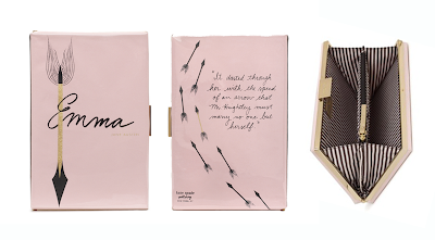
So if you enjoy reading Austen, then it logically follows that you would carry your copy of Emma around with you in clutch that looks exactly like the novel Emma. Or at least I would. Kate Spade apparently thought so too and that is why they designed just that.....does it get anymore adorable than that?

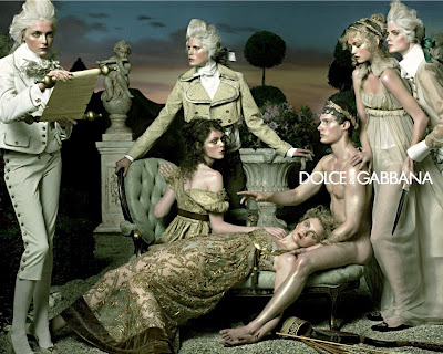
Also in the realm of fashion design, Dolce & Gabbana's Fall collection way back in 2006 clearly references the Regency period in which Austen lived and wrote. I remember going gaga over their gorgeously styled ad campaign, photographed by Steven Meisel.
One of my favorite blogs is Textbook: A Style Blog for Literature & History, a blog for avid readers, history buffs, and clothes horses. As if that wasn't enough, John Jannuzzi, the blog's creator posts style entries creating modern-day ensembles for some of history's and literature's most renowned characters. Readers post questions like, "What would Holden Caufield wear today?" It's super fun to see how he has interpreted each persona. Of course, Austen takes up a lot of real estate on the blog, with looks styled for Elizbeth Bennet and her sister Lydia Bennet (Pride & Prejudice), Emma Woodhouse (Emma), and Elinor Dashwood (Sense & Sensbility). I think they are pretty spot on!
There is even a Jane Austen typeface, based on her actual signature and written letters.
I set my name in it. Just for fun....
Obviously, book jacket design is a significant aspect which I already touched on in other entries. Along with the recent revival of appreciation from Austen purists, there is even more from fanfiction, as with the popular Pride & Prejuduce & Zombies, in which the heroine Elizabeth Bennet and her five sisters must use their ninja fighting skills to find husbands before they are overcome by a zombie epidemic. The cover design cleverly takes a seemingly benign 19th century portrait and covers it with a gruesome flesh-eating disease and demonic red eyes. It's fantastic!
Jane & the Damned follows a similar formula, as does the hilariously titled Mr. Darcy, Vampyre; it sounds so bad that I just have to read it!
So if you enjoy reading Austen, then it logically follows that you would carry your copy of Emma around with you in clutch that looks exactly like the novel Emma. Or at least I would. Kate Spade apparently thought so too and that is why they designed just that.....does it get anymore adorable than that?

Also in the realm of fashion design, Dolce & Gabbana's Fall collection way back in 2006 clearly references the Regency period in which Austen lived and wrote. I remember going gaga over their gorgeously styled ad campaign, photographed by Steven Meisel.
One of my favorite blogs is Textbook: A Style Blog for Literature & History, a blog for avid readers, history buffs, and clothes horses. As if that wasn't enough, John Jannuzzi, the blog's creator posts style entries creating modern-day ensembles for some of history's and literature's most renowned characters. Readers post questions like, "What would Holden Caufield wear today?" It's super fun to see how he has interpreted each persona. Of course, Austen takes up a lot of real estate on the blog, with looks styled for Elizbeth Bennet and her sister Lydia Bennet (Pride & Prejudice), Emma Woodhouse (Emma), and Elinor Dashwood (Sense & Sensbility). I think they are pretty spot on!
There is even a Jane Austen typeface, based on her actual signature and written letters.
I set my name in it. Just for fun....
Designer Profile: Ro&Co
Whilst perusing around online one day, most likely for several hours as you know so often happens (I'll say it was raining so I don't feel too unproductive), one site lead to another site, with lead to a blog, and I happened across the local NYC Tribeca-based Ro&Co Design Firm. Well, I was initially drawn to the mauve-y pink and black color combo and serifed type, to be completely honest. But then as I looked through their portfolio of work, I was so impressed and really inspired by the variety of their design projects.
According to their mission, "RoAndCo is a multi-disciplinary design studio devoted to holistic branding that serves a range of fashion, art, and lifestyle clients." Headed by award-winning Creative Director Roanne Adams, the team collaborates on of wealth of different mediums, ranging from the usual branding and print design, to packaging, video, web, book, textile, and environment design, as well as art direction. The Ro & Co aesthetic is beautifully refined, and at the same time young and fresh. Sooo uh, hiring any time soon....?
On the "about" page on their website, they listed their "Methodology", five things they follow as designers, which I thought was interesting and really sweet in a way. I think it is comforting to know that there are work environments (specifically design firms) where the people are not only creative, but also smart (as evidenced by their design work), and that really honestly want to do good a good job!
Methodology: Five Things We Follow
1. Clients are involved, clients are listened to, clients are inspiration.
2. Challenging and moving beyond what’s already been done is just the beginning.
3. Different for different’s sake: Wrong. Uncommon ideas that are intuitive and exciting: Right.
4. Old meets new. Masculine meets feminine. Capturing the balance is what brings our branding to life.
5. The consumer is as important as the client. We consider how the message is delivered on paper, over the web, and into your iPhone from here to Tanzania.
Daily Drop Cap "W". Wunderbar.
All About Jessica. And Louise Fili. And cookies.
I thought it only fitting that, because I began profiling contemporary designers, this blog would not be complete unless I force fed some more Jessica Hische down your throats and dedicated an entire post to her. And her one-time employer, Louise Fili.
Much to the chagrin of all of you, I am actually not going to post any additional design work from Ms. Hische. Not that there isn't any more. Far far far from it. However, I am instead going to share some of her insights on designing, working, and being creative. She is amazingly accomplished for someone so young, and as a soon-to-be-graduate myself, I think it is really great to hear from someone who was in the same place not so long ago. I am almost creeping myself out because I feel like I am talking about her as if I know her, so I apologize in advance. Jessica, if you ever read this (not terribly likely, considering I have 7 followers) I swear I am not scary, or dangerous, or have stalkerish tendencies; I just really love and respect your work and am constantly inspired by it!
She writes extensively about her process of design, her inspiration, clientele, etc, but she also gets into the nitty gritty, answering questions about life after college and the subsequent change in her work, her experiences as an intern, why she left her Senior Design position at Louise Fili to go the freelance route, and all the while offering real applicable advice, it seems specifically toward young designers. She then answers fun questions like "Are you a serif or a sans-serif kinda girl?" or "What do you feel about anti-font campaigns like “Ban Comic Sans” are they valid?"
As for Louise Fili, the gourmet packager extraordinaire, she is somewhat of an icon in the design world. After working for Herb Lubalin and Pantheon Books, she established Louise Fili Ltd in 1989. The firm specializes in logo, package, restaurant, and book design; if you are from Long Island, you will know her from the beautiful Tate's Bake Shop packaging which house the most sinfully delicious chocolate chip cookies ever to exist. I'm serious. They melt in your mouth.
Daily Drop Cap "I". I really will continue to do my own. I swear. But when time allows....
Much to the chagrin of all of you, I am actually not going to post any additional design work from Ms. Hische. Not that there isn't any more. Far far far from it. However, I am instead going to share some of her insights on designing, working, and being creative. She is amazingly accomplished for someone so young, and as a soon-to-be-graduate myself, I think it is really great to hear from someone who was in the same place not so long ago. I am almost creeping myself out because I feel like I am talking about her as if I know her, so I apologize in advance. Jessica, if you ever read this (not terribly likely, considering I have 7 followers) I swear I am not scary, or dangerous, or have stalkerish tendencies; I just really love and respect your work and am constantly inspired by it!
She writes extensively about her process of design, her inspiration, clientele, etc, but she also gets into the nitty gritty, answering questions about life after college and the subsequent change in her work, her experiences as an intern, why she left her Senior Design position at Louise Fili to go the freelance route, and all the while offering real applicable advice, it seems specifically toward young designers. She then answers fun questions like "Are you a serif or a sans-serif kinda girl?" or "What do you feel about anti-font campaigns like “Ban Comic Sans” are they valid?"
She also recently redesigned her website, adding a fun little feature: you can now view her page in "Normal Mode"....
or in "Teen Girl Mode", complete with lime green and magenta Comic Sans, sparkly stars, and a wolf family. I swear, this girl cracks me up!!!!
As for Louise Fili, the gourmet packager extraordinaire, she is somewhat of an icon in the design world. After working for Herb Lubalin and Pantheon Books, she established Louise Fili Ltd in 1989. The firm specializes in logo, package, restaurant, and book design; if you are from Long Island, you will know her from the beautiful Tate's Bake Shop packaging which house the most sinfully delicious chocolate chip cookies ever to exist. I'm serious. They melt in your mouth.
Daily Drop Cap "I". I really will continue to do my own. I swear. But when time allows....
Tuesday, April 19, 2011
Live Colorfully!
Has anyone seen the Kate Spade New York campaign Live Colorfully? The company has collaborated with different local artists on this year long project dedicated entirely to color! Each month, they highlight a color and an artist's creative response on their new blog. What I love about Kate Spade as a company is their ability to maintain brand consistency throughout all aspects of their company, from their fashion and accessory products, to their whimsical ad campaigns, and then really unique creative projects like Live Colorfully. Everything always has a distinctive look that is completely cohesive with their brand. Go Kate Spade!
Monday, April 18, 2011
Vivez la Langue
Because I just like to make myself miserable, I am dedicating yet another post to my study abroad experience. It's just because EVERYTHING in Europe is so thoroughly amazing. I can't help it.
Though I was studying and traveling primarily in and around Italy, I did get the opportunity to go to Paris for a week. [Sighhh] I may, or may not, have actually cried when we landed at Charles du Gall (which we eventually learned to correctly pronounce "sha-doo-gull"). I was that excited. Paris is just such a majestic and romantic city from the wide tree-lined avenues to the breathtaking architecture. And the crepe stands at every corner. It's no wonder that Paris has inspired generations of artists. As part of Education First's Live the Language Campaign, they created absolutely beautiful videos for the cities Paris, London, Barcelona, and Beijing. Each video features, what I am going to call "city-specific type" to illustrate various vocabulary words.
Vivez la Langue (Live the Language): Paris
And now I officially have the travel bug. Again.
The Daily Drop Cap "b". Brilliant.
When in Rome....
"Rome! By all means Rome. I will cherish my visit here in memory as long as I live."
-Audrey Hephern, Roman Holiday (1953)
Once upon a Sophmore year, I spent a semester studying abroad in Rome, Italy. To say that it was the single greatest experience of my life may be a little dramatic, and yet it is entirely true. Consequently, thinking about Rome makes me a little weepy (to say the least) so I will try to keep my composure as I write this post.
On one of my many shopping excursions walking down the lovely Via del Corso towards Piazza Venezia, I stopped into a book store and happened across this little gem. Travel Italia: L'eta D'oro del Manifesto Turistico, or 'The Golden Age of Italian Travel Posters', by Lorenzo Ottaviani, is a collection of vintage posters from the 1920s to the 1960s. Organized by region, the book features 170 vintage posters and designer bios. Even though it is 100% written in Italian, and let's just say that my Italian is not exactly 100%, this book is still a constant source of visual inspiration for me, from the beautiful colors to the typography. From the cover to cover, the book is beautifully and meticulously designed. And I'm not the only person to think so.....Mr. Milton Glaser himself said of the collection, "At last a book that documents the long overlooked history of Italian poster design with understanding and elegance. A beautiful piece of work.”
Not too shabby.
Subscribe to:
Posts (Atom)


